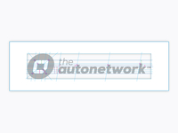
Similar in thought to the previous ADXPRS logo deconstruction.
Not pixel perfect-work in progress.
The lines, arrows, circles show important areas of balance, vertical and horizontal alignment as well as intersections of key areas of the logo.
Where possible I design in all these various alignments and intersections in order to bring harmony and interconnectedness within the logo.
The circles show key areas of vertical, diagonal and horizontal intersections and alignments, the vertical arrows generally show where space is 'equally halved' once then twice, usually relating to type baselines, ascenders and/or descenders in relation to the contained logomark.
For example the 'a' in the circle has a middle point that aligns with the x-height of 'autonetwork', which half of the x-height is equal to half the width of the a's thickness, then half of that is equal to the bottom portion of the types' counters in letters such as the: a, u, o etc
You can see a larger version here: http://www.flickr.com/photos/grahamsblog/9311214537/