Clik here to view.

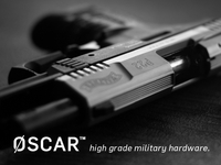
Oscar is a line of military products that are currently being tendered and delivered to Western Defence forces. The products are high precision, innovative and state of the art mechanical and electro-mechanical systems, ranging from: Night Vision Equipment to personal communication and weapon systems, delivered on time and on budget.
Logo lock-ups: http://cl.ly/QO8R
Enlargement of 'shot': http://cl.ly/QNaJ
Key point in the brief was to deliver a clean but strong type only logo design, but if possible to design in some kind of identifying mark as the logo will be laser etched onto the 'Oscar' range of products as well as looking respectable in printed and online product brochure and presentations.
Functional and fuss free logotype; understated in one respect, but quite strong in another.
I liked the idea of associating the initial with a somewhat aggressive military action: strike, which is where the strike-through makes it's appearance thus giving the 'O' double duty as a numeral and letter. Important not to load the logo with military visual cliches, but at the same time trying to design it so it does look like it represents a military brand.
I've made the strike-through appear to 'shoot' over the bottom half—which is as close to using a cliche Mash type stencil font as I was prepared to go—and under the top half.
Challenge is to find a font that looks clean, but also has that slight technical 'edge'. So the line through the O seems to be a good visual hook (can also be pulled out and used as a favicon etc), whilst the curves of the font help bring it more into the aesthetically pleasing side.
